        <div class="section             section--mt-large
                 section--mb-large
     content-image">
    <div class="section__inner h-container">
        <div class="grid">
            <div class="grid__col grid__col--xs-4 grid__col--sm-12 grid__col--md-11 grid__col--offset-md-1">
                <div class="section__title animation__target">
                    <h2>How we do it</h2>
                </div>
                <div class="section__content ">
                    <div class="content-image__grid grid">
                        <div class="grid__col grid__col--md-6 grid__col--lg-5 content-image__col content-image__col--items">
                            <div class="content-image__item animation__target">
                                <h3 class="h3 content-image__title">Discover</h3>
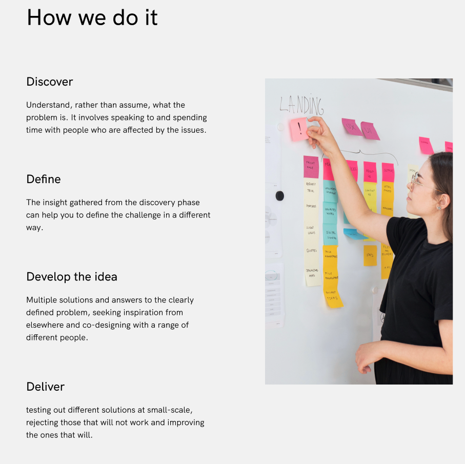
                                <p>Understand, rather than assume, what the problem is. It involves speaking to and spending time with people who are affected by the issues.</p>
                            </div>
                            <div class="content-image__item animation__target">
                                <h3 class="h3 content-image__title">Define</h3>
                                <p>Multiple solutions and answers to the clearly defined problem, seeking inspiration from elsewhere and co-designing with a range of different people.</p>
                            </div>
                            <div class="content-image__item animation__target">
                                <h3 class="h3 content-image__title">Develop the idea</h3>
                                <p>Multiple solutions and answers to the clearly defined problem, seeking inspiration from elsewhere and co-designing with a range of different people.</p>
                            </div>
                            <div class="content-image__item animation__target">
                                <h3 class="h3 content-image__title">Deliver</h3>
                                <p>testing out different solutions at small-scale, rejecting those that will not work and improving the ones that will.</p>
                            </div>
                        </div>
                        <div class="grid__col grid__col--md-6 grid__col--offset-lg-1 content-image__col">
                            <figure class="image image--fluid content-image__image animation__target">
                                <img loading="lazy" src="data:image/svg+xml,%3Csvg%20xmlns%3D%22http%3A%2F%2Fwww.w3.org%2F2000%2Fsvg%22%20viewBox%3D%220%200%201360%201360%22%3E%3C%2Fsvg%3E" data-srcset="https://via.placeholder.com/1000x1620" data-sizes="auto" alt="" class="image__img lazyload">

                            </figure>
                        </div>
                    </div>

                </div>

            </div>
        </div>
    </div>
</div>
        {% set topSpacing %}
    {% if 'small' in data.topSpacing %}
        section--mt-small
    {% elseif 'medium' in data.topSpacing %}
        section--mt-medium
    {% else %}
        section--mt-large
    {% endif %}
{% endset %}

{% set bottomSpacing %}
    {% if 'small' in data.bottomSpacing %}
        section--mb-small
    {% elseif 'medium' in data.bottomSpacing %}
        section--mb-medium
    {% else %}
        section--mb-large
    {% endif %}
{% endset %}

{% set content %}
    <div class="content-image__grid grid">
        {% if data.items %}
            <div class="grid__col grid__col--md-6 grid__col--lg-5 content-image__col content-image__col--items">
                {% for item in data.items %}
                    <div class="content-image__item animation__target">
                        {% if item.title %}
                            <h3 class="h3 content-image__title">{{ item.title }}</h3>
                        {% endif %}
                        {% if item.content %}
                            {{ item.content }}
                        {% endif %}
                    </div>
                {% endfor %}
            </div>
        {% endif %}
        {% if data.image %}
            <div class="grid__col grid__col--md-6 grid__col--offset-lg-1 content-image__col">
                {% include '@image' with { data: data.image|srcset('1360x1360f'), class: 'content-image__image animation__target', modifier: 'image--fluid' } %}
            </div>
        {% endif %}
    </div>
{% endset %}

{% include '@section' with { class: 'content-image', modifier: topSpacing ~ ' ' ~ bottomSpacing, data: { title: data.title, content: content }, container: true } %}
        {
  "language": "en-US",
  "data": {
    "title": "How we do it",
    "items": [
      {
        "title": "Discover",
        "content": "<p>Understand, rather than assume, what the problem is. It involves speaking to and spending time with people who are affected by the issues.</p>"
      },
      {
        "title": "Define",
        "content": "<p>Multiple solutions and answers to the clearly defined problem, seeking inspiration from elsewhere and co-designing with a range of different people.</p>"
      },
      {
        "title": "Develop the idea",
        "content": "<p>Multiple solutions and answers to the clearly defined problem, seeking inspiration from elsewhere and co-designing with a range of different people.</p>"
      },
      {
        "title": "Deliver",
        "content": "<p>testing out different solutions at small-scale, rejecting those that will not work and improving the ones that will.</p>"
      }
    ],
    "image": {
      "srcset": "https://via.placeholder.com/1000x1620"
    }
  }
}
