<div class="section section--mt-large section--mb-large explore-grid">
<div class="section__inner h-container">
<div class="grid">
<div class="grid__col grid__col--xs-4 grid__col--sm-12 grid__col--md-11 grid__col--offset-md-1">
<div class="section__title animation__target">
<h2>Explore further</h2>
</div>
<div class="section__content ">
<div class="grid explore-grid__inner">
<div class="grid__col grid__col--sm-6 explore-grid__col animation__target">
<div class="explore explore-grid__explore ">
<figure class="image explore__image">
<img loading="lazy" src="data:image/svg+xml,%3Csvg%20xmlns%3D%22http%3A%2F%2Fwww.w3.org%2F2000%2Fsvg%22%20viewBox%3D%220%200%20548%20324%22%3E%3C%2Fsvg%3E" data-srcset="//via.placeholder.com/548x324 548w, //via.placeholder.com/1096x648 1096w" data-sizes="auto" alt="" class="image__img lazyload">
</figure>
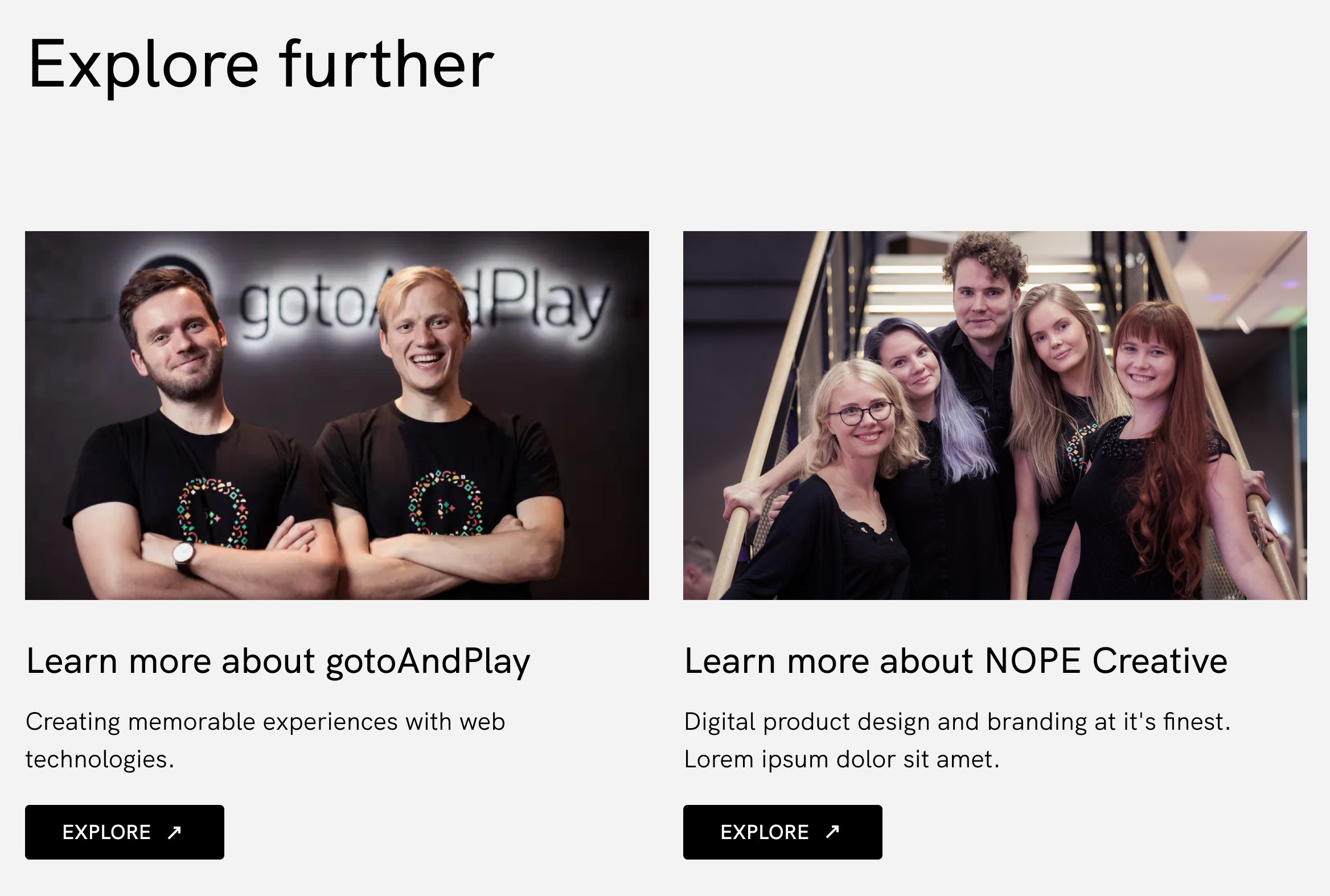
<h3 class="h3 explore__title">Learn more about gotoAndPlay</h3>
<div class="text explore__description">Creating memorable experiences with web technologies.</div>
<a href="#" class="button button--arrow-rotate button--magnetic explore__button button--icon-right" target="_blank">
<span class="button__filler"></span>
<span class="button__inner">
<span class="button__icon-wrapper"><svg class="icon button__icon">
<use xlink:href="../../inc/svg/global.bc9cdd731ad718497c5d8f03d08908d4.svg#tiny-right-top-24"></use>
</svg>
</span> <span class="button__text">Explore</span>
</span>
</a>
</div>
</div>
<div class="grid__col grid__col--sm-6 explore-grid__col animation__target">
<div class="explore explore-grid__explore ">
<figure class="image explore__image">
<img loading="lazy" src="data:image/svg+xml,%3Csvg%20xmlns%3D%22http%3A%2F%2Fwww.w3.org%2F2000%2Fsvg%22%20viewBox%3D%220%200%20548%20324%22%3E%3C%2Fsvg%3E" data-srcset="//via.placeholder.com/548x324 548w, //via.placeholder.com/1096x648 1096w" data-sizes="auto" alt="" class="image__img lazyload">
</figure>
<h3 class="h3 explore__title">Learn more about gotoAndPlay</h3>
<div class="text explore__description">Creating memorable experiences with web technologies.</div>
<a href="#" class="button button--arrow-rotate button--magnetic explore__button button--icon-right" target="_blank">
<span class="button__filler"></span>
<span class="button__inner">
<span class="button__icon-wrapper"><svg class="icon button__icon">
<use xlink:href="../../inc/svg/global.bc9cdd731ad718497c5d8f03d08908d4.svg#tiny-right-top-24"></use>
</svg>
</span> <span class="button__text">Explore</span>
</span>
</a>
</div>
</div>
</div>
</div>
</div>
</div>
</div>
</div>
        {% set topSpacing %}
    {% apply spaceless %}
        {% if 'small' in data.topSpacing %}
            section--mt-small
        {% elseif 'medium' in data.topSpacing %}
            section--mt-medium
        {% else %}
            section--mt-large
        {% endif %}
    {% endapply %}
{% endset %}

{% set bottomSpacing %}
    {% apply spaceless %}
        {% if 'small' in data.bottomSpacing %}
            section--mb-small
        {% elseif 'medium' in data.bottomSpacing %}
            section--mb-medium
        {% else %}
            section--mb-large
        {% endif %}
    {% endapply %}
{% endset %}

{% set content %}
    {% if data.items %}
        <div class="grid explore-grid__inner">
            {% for item in data.items %}
                <div class="grid__col grid__col--sm-6 explore-grid__col animation__target">
                    {% include '@explore' with { data: item, class: 'explore-grid__explore', modifier: '' } %}
                </div>
            {% endfor %}
        </div>
    {% endif %}
{% endset %}
{% include '@section' with { class: 'explore-grid', modifier: topSpacing ~ ' ' ~ bottomSpacing, data: { content: content, title: data.title }, container: true } %}
        {
  "language": "en-US",
  "data": {
    "title": "Explore further",
    "items": [
      {
        "title": "Learn more about gotoAndPlay",
        "description": "Creating memorable experiences with web technologies.",
        "image": true,
        "button": {
          "text": "Explore",
          "link": "#",
          "attributes": "target=\"_blank\""
        }
      },
      {
        "title": "Learn more about gotoAndPlay",
        "description": "Creating memorable experiences with web technologies.",
        "image": true,
        "button": {
          "text": "Explore",
          "link": "#",
          "attributes": "target=\"_blank\""
        }
      }
    ]
  }
}
-
Content:
.explore-grid__inner { margin-bottom: -120px; @include bp (md-min) { margin-bottom: $grid-gutter-sm; } } .explore-grid__col { margin-bottom: 120px; @include bp (md-min) { margin-bottom: -$grid-gutter-sm; } } - URL: /components/raw/explore-grid/explore-grid.scss
- Filesystem Path: src/patterns/modules/explore-grid/explore-grid.scss
- Size: 251 Bytes
-
Content:
import './explore-grid.scss'; - URL: /components/raw/explore-grid/explore-grid.ts
- Filesystem Path: src/patterns/modules/explore-grid/explore-grid.ts
- Size: 30 Bytes
-
Content:
- URL: /components/raw/explore-grid/preview.jpg
- Filesystem Path: src/patterns/modules/explore-grid/preview.jpg
- Size: 2.2 MB